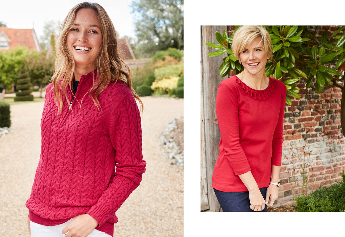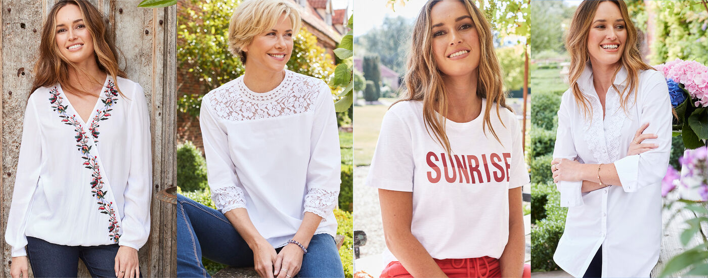


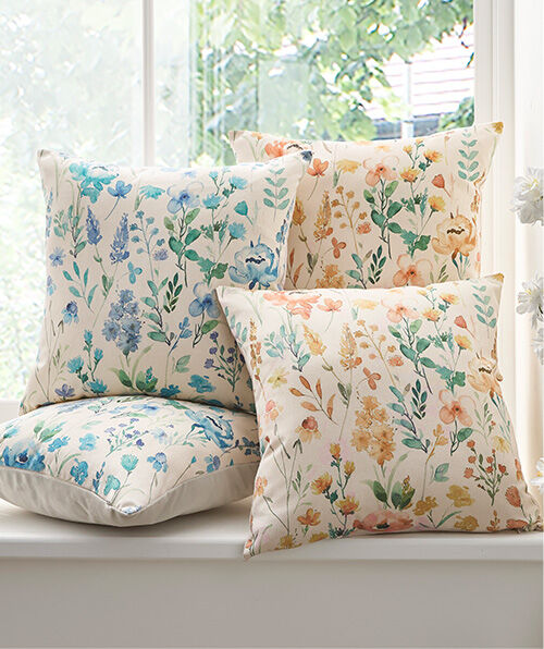

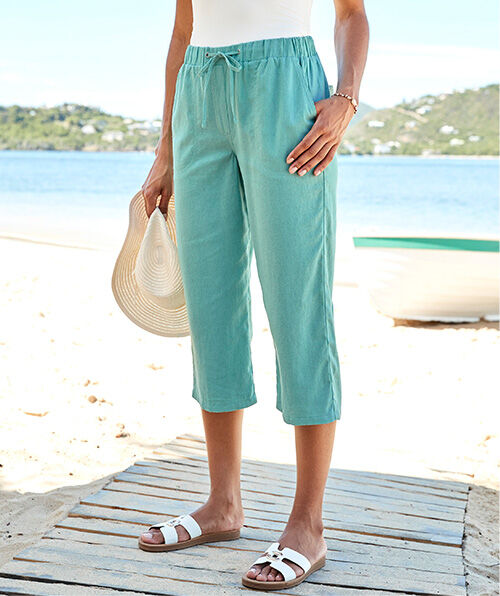


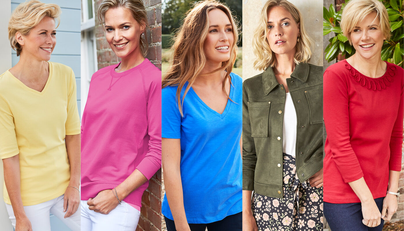
I think we can all agree that colour makes us happy...but, when you open your wardrobe, what is it that makes you reach for a white blouse over a red one? There could be more to it than you initially thought!
The way we dress is, without a doubt, another way for us to express ourselves. Colour and pattern are a brilliant way to show your personality, but they can also influence mood.
When it comes to colour, there’s no right or wrong answer. What’s most important is that you dress to make yourself happy - if that means yellow brings you down and black builds you up, that’s fine! But, if you’re wondering how to dress to show a little bit more of your personality or how you’re feeling that day, we’re here to help you make colour work for you.
Colour theory
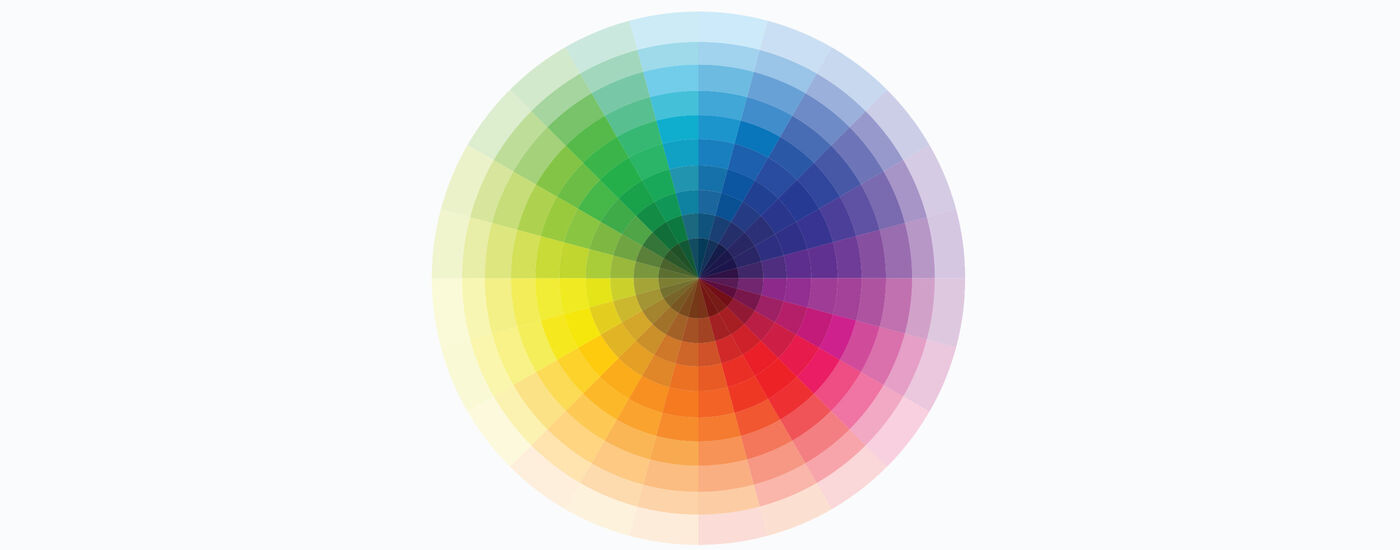
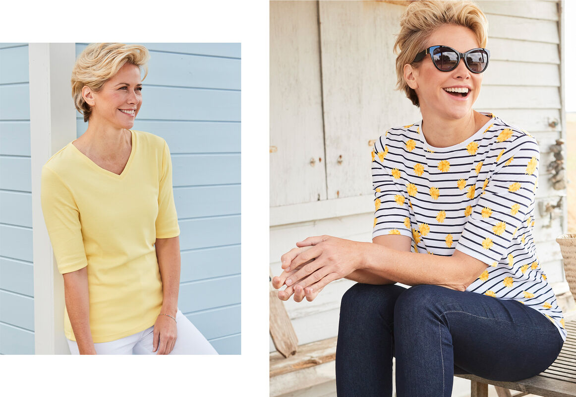
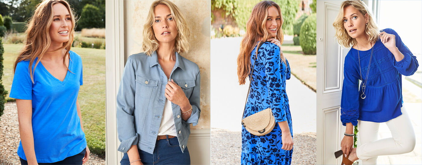
Colour’s all around us, even when we don’t notice it - in fact, the human eye can see around a million different colours, and that’s before we start counting the ones we can’t see. Although colour connotations are cultural and subjective, colours like red, orange, pink and yellow are thought to be warm, and purples, blues and greens are thought to be cold.
Colour harmony refers to colours that look good together. Artists and designers will use colour theory when they’re deciding on a particular mood for their project. You might know instinctively which colours work together but, failing that, you can refer to the colour wheel.
Complementary
Colours that work well together usually sit on opposite sides of the wheel, and when they’re side-by-side, they look even brighter and better. Dressing in complementary colours is often seen as quite bold but it’s also easy to do it in a more understated way with colourful bags, scarves or jewellery.
Monochromatic
As well as reading the wheel from side to side, you can use it to discover shades, tones and tints of a base colour. If you love dressing in neutrals, you might already be used to dressing in monochrome. Play with texture to add interest to your outfits, like pairing a silk scarf with a fluffy faux fur coat!
Analogous
Three colours side by side on the wheel are referred to as analogous colours, they’re endlessly versatile, but could be a bit much all in one outfit. Keep things simple by choosing one to be the base colour, and adding the others as accents. We love a navy suit worn with a light blue blouse and turquoise jewellery!